If you’ve ever applied for a credit card or loan, you know that financial firms process your information before making a decision. This is because giving you a loan can have a serious financial impact on their business. But how do they make a decision? In this blog, we will learn how to prepare credit application data. After that, we will apply machine learning and business rules to reduce risk and ensure profitability. We will use two data sets that emulate real credit applications while focusing on business value.
1. Exploring and Preparing Loan Data
In this first section, we will discuss the concept of credit risk and define how it is calculated. Using cross tables and plots, we will explore a real-world data set. Before applying machine learning, we will process this data by finding and resolving problems.
1.1 Explore the credit data
Well begin by loading in the dataset cr_loan.
# import required packagesimport pandas as pdimport matplotlib.pyplot as pltimport matplotlib.colors# load in our datasetcr_loan = pd.read_csv('Data/cr_loan2.csv')cr_loan
person_age
person_income
person_home_ownership
person_emp_length
loan_intent
loan_grade
loan_amnt
loan_int_rate
loan_status
loan_percent_income
cb_person_default_on_file
cb_person_cred_hist_length
0
22
59000
RENT
123.0
PERSONAL
D
35000
16.02
1
0.59
Y
3
1
21
9600
OWN
5.0
EDUCATION
B
1000
11.14
0
0.10
N
2
2
25
9600
MORTGAGE
1.0
MEDICAL
C
5500
12.87
1
0.57
N
3
3
23
65500
RENT
4.0
MEDICAL
C
35000
15.23
1
0.53
N
2
4
24
54400
RENT
8.0
MEDICAL
C
35000
14.27
1
0.55
Y
4
...
...
...
...
...
...
...
...
...
...
...
...
...
32576
57
53000
MORTGAGE
1.0
PERSONAL
C
5800
13.16
0
0.11
N
30
32577
54
120000
MORTGAGE
4.0
PERSONAL
A
17625
7.49
0
0.15
N
19
32578
65
76000
RENT
3.0
HOMEIMPROVEMENT
B
35000
10.99
1
0.46
N
28
32579
56
150000
MORTGAGE
5.0
PERSONAL
B
15000
11.48
0
0.10
N
26
32580
66
42000
RENT
2.0
MEDICAL
B
6475
9.99
0
0.15
N
30
32581 rows × 12 columns
In this data set, loan_status shows whether the loan is currently in default with 1 being default and 0 being non-default.
We have eleven other columns within the data, and many could have a relationship with the values in loan_status. We will explore the data and these relationships more with further analysis to understand the impact of the data on credit loan defaults.
Checking the structure of the data as well as seeing a snapshot helps us better understand what’s inside the set. Let’s check what type of data we are dealing with here and then look at the first five rows:
# Check the first five rows of the datacr_loan.head()
person_age
person_income
person_home_ownership
person_emp_length
loan_intent
loan_grade
loan_amnt
loan_int_rate
loan_status
loan_percent_income
cb_person_default_on_file
cb_person_cred_hist_length
0
22
59000
RENT
123.0
PERSONAL
D
35000
16.02
1
0.59
Y
3
1
21
9600
OWN
5.0
EDUCATION
B
1000
11.14
0
0.10
N
2
2
25
9600
MORTGAGE
1.0
MEDICAL
C
5500
12.87
1
0.57
N
3
3
23
65500
RENT
4.0
MEDICAL
C
35000
15.23
1
0.53
N
2
4
24
54400
RENT
8.0
MEDICAL
C
35000
14.27
1
0.55
Y
4
# get an overview of the numeric columnscr_loan.describe()
person_age
person_income
person_emp_length
loan_amnt
loan_int_rate
loan_status
loan_percent_income
cb_person_cred_hist_length
count
32581.000000
3.258100e+04
31686.000000
32581.000000
29465.000000
32581.000000
32581.000000
32581.000000
mean
27.734600
6.607485e+04
4.789686
9589.371106
11.011695
0.218164
0.170203
5.804211
std
6.348078
6.198312e+04
4.142630
6322.086646
3.240459
0.413006
0.106782
4.055001
min
20.000000
4.000000e+03
0.000000
500.000000
5.420000
0.000000
0.000000
2.000000
25%
23.000000
3.850000e+04
2.000000
5000.000000
7.900000
0.000000
0.090000
3.000000
50%
26.000000
5.500000e+04
4.000000
8000.000000
10.990000
0.000000
0.150000
4.000000
75%
30.000000
7.920000e+04
7.000000
12200.000000
13.470000
0.000000
0.230000
8.000000
max
144.000000
6.000000e+06
123.000000
35000.000000
23.220000
1.000000
0.830000
30.000000
# get an overview of the numeric columnscr_loan.describe(include='object')
person_home_ownership
loan_intent
loan_grade
cb_person_default_on_file
count
32581
32581
32581
32581
unique
4
6
7
2
top
RENT
EDUCATION
A
N
freq
16446
6453
10777
26836
Similarly, visualizations provide a high level view of the data in addition to important trends and patterns. Let’s plot a histogram of loan_amt which will provide us with a visual of the distribution of loan amounts.
# Look at the distribution of loan amounts with a histogramn, bins, patches = plt.hist(x=cr_loan['loan_amnt'], bins='auto', color='blue',alpha=0.7, rwidth=0.85)plt.xlabel("Loan Amount")plt.show()
Let’s investigate the relationship between income and age, by creating a scatter plot. In this case, income is the independent variable and age is the dependent variable.
print("There are over 32 000 rows of data so the scatter plot may take a little while to plot.")# Plot a scatter plot of income against ageplt.scatter(cr_loan['person_income'], cr_loan['person_age'],c='blue', alpha=0.5)plt.xlabel('Personal Income')plt.ylabel('Person Age')plt.show()
There are over 32 000 rows of data so the scatter plot may take a little while to plot.
Starting with data exploration helps us keep from getting a.head() of ourselves! We can already see a positive correlation with age and income, which could mean these older recipients are further along in their career and therefore earn higher salaries. There also appears to be an outlier in the data.
1.2 Crosstab and pivot tables
Often, financial data is viewed as a pivot table in spreadsheets like Excel. With cross tables, we can get a high level view of selected columns and even aggregation like a count or average. For most credit risk models, especially for probability of default, columns like person_emp_length and person_home_ownership are common to begin investigating.
We will be able to see how the values are populated throughout the data, and visualize them. For now, we need to check how loan_status is affected by factors like home ownership status, loan grade, and loan percentage of income.
Let’s dive in, and create a cross table of loan_intent and loan_status :
# Create a cross table of the loan intent and loan statuspd.crosstab(cr_loan['loan_intent'], cr_loan['loan_status'], margins =True)
loan_status
0
1
All
loan_intent
DEBTCONSOLIDATION
3722
1490
5212
EDUCATION
5342
1111
6453
HOMEIMPROVEMENT
2664
941
3605
MEDICAL
4450
1621
6071
PERSONAL
4423
1098
5521
VENTURE
4872
847
5719
All
25473
7108
32581
So, the largest number of loan defaults 1,621 happen when the reason for the loan was to cover medical expenses. That is perhaps not surprising - in some cases the medical conditon might mean that the loan customer is unable to work and therefore might struggle to keep up with the loan repayments.
Let’s now look at home ownership grouped by loan_status and loan_grade :
# Create a cross table of home ownership, loan status, and gradepd.crosstab(cr_loan['person_home_ownership'],[cr_loan['loan_status'],cr_loan['loan_grade']])
loan_status
0
1
loan_grade
A
B
C
D
E
F
G
A
B
C
D
E
F
G
person_home_ownership
MORTGAGE
5219
3729
1934
658
178
36
0
239
324
321
553
161
61
31
OTHER
23
29
11
9
2
0
0
3
5
6
11
6
2
0
OWN
860
770
464
264
26
7
0
66
34
31
18
31
8
5
RENT
3602
4222
2710
554
137
28
1
765
1338
981
1559
423
99
27
So the largest amount of loan defaults 1,559 happen where the customer is a renter, and has taken out a loan grade D. We don’t know what these gradings mean and should find out more to aid our understanding.
Let’s now look at home ownership grouped by loan_status and average loan_percent_income :
# Create a cross table of home ownership, loan status, and average percent incomepd.crosstab(cr_loan['person_home_ownership'], cr_loan['loan_status'], values=cr_loan['loan_percent_income'], aggfunc='mean')
loan_status
0
1
person_home_ownership
MORTGAGE
0.146504
0.184882
OTHER
0.143784
0.300000
OWN
0.180013
0.297358
RENT
0.144611
0.264859
Let’s now create a boxplot of the loan’s percent of the person’s income grouped by loan_status :
# Create a box plot of percentage income by loan statuscr_loan.boxplot(column = ['loan_percent_income'], by ='loan_status')plt.title('Average Percent Income by Loan Status')plt.suptitle('')plt.show()
It looks like the average percentage of income for defaults is higher. This could indicate those recipients have a debt-to-income ratio that’s already too high.
1.3 Finding outliers with cross tables
Now we need to find and remove outliers we suspect might be in the data. For this exercise, we can use cross tables and aggregate functions.
Have a look at the person_emp_length column. We used the aggfunc = mean argument to see the average of a numeric column before, but to detect outliers we can use other functions like min and max.
It may not be possible for a person to have an employment length of less than 0 or greater than 60. We can use cross tables to check the data and see if there are any instances of this!
Let’s print the cross table of loan_status and person_home_ownership with the maxperson_emp_length :
# Create the cross table for loan status, home ownership, and the max employment lengthpd.crosstab(cr_loan['loan_status'],cr_loan['person_home_ownership'], values=cr_loan['person_emp_length'], aggfunc='max')
person_home_ownership
MORTGAGE
OTHER
OWN
RENT
loan_status
0
123.0
24.0
31.0
41.0
1
34.0
11.0
17.0
123.0
Let’s now create an array of indices for records with an employment length greater than 60. Store it as indices.
# Create an array of indices where employment length is greater than 60indices = cr_loan[cr_loan['person_emp_length'] >60].index
And then drop those records from the data :
# Drop the records from the data based on the indices and create a new dataframecr_loan = cr_loan.drop(indices)cr_loan
person_age
person_income
person_home_ownership
person_emp_length
loan_intent
loan_grade
loan_amnt
loan_int_rate
loan_status
loan_percent_income
cb_person_default_on_file
cb_person_cred_hist_length
1
21
9600
OWN
5.0
EDUCATION
B
1000
11.14
0
0.10
N
2
2
25
9600
MORTGAGE
1.0
MEDICAL
C
5500
12.87
1
0.57
N
3
3
23
65500
RENT
4.0
MEDICAL
C
35000
15.23
1
0.53
N
2
4
24
54400
RENT
8.0
MEDICAL
C
35000
14.27
1
0.55
Y
4
5
21
9900
OWN
2.0
VENTURE
A
2500
7.14
1
0.25
N
2
...
...
...
...
...
...
...
...
...
...
...
...
...
32576
57
53000
MORTGAGE
1.0
PERSONAL
C
5800
13.16
0
0.11
N
30
32577
54
120000
MORTGAGE
4.0
PERSONAL
A
17625
7.49
0
0.15
N
19
32578
65
76000
RENT
3.0
HOMEIMPROVEMENT
B
35000
10.99
1
0.46
N
28
32579
56
150000
MORTGAGE
5.0
PERSONAL
B
15000
11.48
0
0.10
N
26
32580
66
42000
RENT
2.0
MEDICAL
B
6475
9.99
0
0.15
N
30
32579 rows × 12 columns
We now have 32,759 rows - two have been removed following our removal of records with an employment length greater than 60.
# Create the cross table from earlier and include minimum employment lengthpd.crosstab(cr_loan['loan_status'],cr_loan['person_home_ownership'], values=cr_loan['person_emp_length'], aggfunc=['min','max'])
min
max
person_home_ownership
MORTGAGE
OTHER
OWN
RENT
MORTGAGE
OTHER
OWN
RENT
loan_status
0
0.0
0.0
0.0
0.0
38.0
24.0
31.0
41.0
1
0.0
0.0
0.0
0.0
34.0
11.0
17.0
27.0
Generally with credit data, key columns like person_emp_length are of high quality, but there is always room for error. With this in mind, we build our intuition for detecting outliers!
1.4 Visualizing credit outliers
We discovered outliers in person_emp_length where values greater than 60 were far above the norm. person_age is another column in which a person can use a common sense approach to say it is very unlikely that a person applying for a loan will be over 100 years old.
Visualizing the data here can be another easy way to detect outliers. We can use other numeric columns like loan_amnt and loan_int_rate to create plots with person_age to search for outliers.
Let’s create a scatter plot of person_age on the x-axis and loan_amnt on the y-axis :
# Create the scatter plot for age and amountplt.scatter(cr_loan['person_age'], cr_loan['loan_amnt'], c='blue', alpha=0.5)plt.xlabel("Person Age")plt.ylabel("Loan Amount")plt.show()
Let’s use the .drop() method from Pandas to remove the outliers :
# Use Pandas to drop the record from the data frame and create a new onecr_loan = cr_loan.drop(cr_loan[cr_loan['person_age'] >100].index)cr_loan
person_age
person_income
person_home_ownership
person_emp_length
loan_intent
loan_grade
loan_amnt
loan_int_rate
loan_status
loan_percent_income
cb_person_default_on_file
cb_person_cred_hist_length
1
21
9600
OWN
5.0
EDUCATION
B
1000
11.14
0
0.10
N
2
2
25
9600
MORTGAGE
1.0
MEDICAL
C
5500
12.87
1
0.57
N
3
3
23
65500
RENT
4.0
MEDICAL
C
35000
15.23
1
0.53
N
2
4
24
54400
RENT
8.0
MEDICAL
C
35000
14.27
1
0.55
Y
4
5
21
9900
OWN
2.0
VENTURE
A
2500
7.14
1
0.25
N
2
...
...
...
...
...
...
...
...
...
...
...
...
...
32576
57
53000
MORTGAGE
1.0
PERSONAL
C
5800
13.16
0
0.11
N
30
32577
54
120000
MORTGAGE
4.0
PERSONAL
A
17625
7.49
0
0.15
N
19
32578
65
76000
RENT
3.0
HOMEIMPROVEMENT
B
35000
10.99
1
0.46
N
28
32579
56
150000
MORTGAGE
5.0
PERSONAL
B
15000
11.48
0
0.10
N
26
32580
66
42000
RENT
2.0
MEDICAL
B
6475
9.99
0
0.15
N
30
32574 rows × 12 columns
We now have 32,574 rows - a further five have been removed following our removal of records with an age greater than 100.
Then, let’s create a scatter plot of person_age on the x-axis and loan_int_rate on the y-axis with a label for loan_status :
# Create a scatter plot of age and interest ratecolors = ["blue","red"] # default is redplt.scatter(cr_loan['person_age'], cr_loan['loan_int_rate'], c = cr_loan['loan_status'], cmap = matplotlib.colors.ListedColormap(colors), alpha=0.5)plt.xlabel("Person Age")plt.ylabel("Loan Interest Rate")plt.show()
Notice that in the last plot we have loan_status as a label for colors. This shows a different color depending on the class (red for default). In this case, it’s loan default and non-default, and it looks like there are more defaults with high interest rates.
1.5 Replacing missing credit data
missing_data.JPG
missing_data_perf.JPG
Now, we should check for missing data. If we find missing data within loan_status, we would not be able to use the data for predicting probability of default because we wouldn’t know if the loan was a default or not. Missing data within person_emp_length would not be as damaging, but would still cause training errors.
So, let’s check for missing data in the person_emp_length column and replace any missing values with the median.
# Print a null value column arraycr_loan.columns[cr_loan.isnull().any()]
# Print the top five rows with nulls for employment lengthcr_loan[cr_loan['person_emp_length'].isnull()].head()
person_age
person_income
person_home_ownership
person_emp_length
loan_intent
loan_grade
loan_amnt
loan_int_rate
loan_status
loan_percent_income
cb_person_default_on_file
cb_person_cred_hist_length
105
22
12600
MORTGAGE
NaN
PERSONAL
A
2000
5.42
1
0.16
N
4
222
24
185000
MORTGAGE
NaN
EDUCATION
B
35000
12.42
0
0.19
N
2
379
24
16800
MORTGAGE
NaN
DEBTCONSOLIDATION
A
3900
NaN
1
0.23
N
3
407
25
52000
RENT
NaN
PERSONAL
B
24000
10.74
1
0.46
N
2
408
22
17352
MORTGAGE
NaN
EDUCATION
C
2250
15.27
0
0.13
Y
3
# Impute the null values with the median value for all employment lengthscr_loan['person_emp_length'].fillna((cr_loan['person_emp_length'].median()), inplace=True)# Create a histogram of employment lengthn, bins, patches = plt.hist(cr_loan['person_emp_length'], bins='auto', color='blue')plt.xlabel("Person Employment Length")plt.show()
We can use several different functions like mean() and median() to replace missing data. The goal here is to keep as much of our data as we can! It’s also important to check the distribution of that feature to see if it changed.
1.6 Removing missing data
We replaced missing data in person_emp_length, but in the previous section we saw that loan_int_rate has missing data as well.
Similar to having missing data within loan_status, having missing data within loan_int_rate will make predictions difficult.
Because interest rates are set by our company, having missing data in this column is very strange. It’s possible that data ingestion issues created errors, but we cannot know for sure. For now, it’s best to .drop() these records before moving forward.
# Print the number of nullsprint(cr_loan['loan_int_rate'].isnull().sum())# Store the array on indicesindices = cr_loan[cr_loan['loan_int_rate'].isnull()].index# Save the new data without missing datacr_loan_clean = cr_loan.drop(indices)
3115
cr_loan_clean
person_age
person_income
person_home_ownership
person_emp_length
loan_intent
loan_grade
loan_amnt
loan_int_rate
loan_status
loan_percent_income
cb_person_default_on_file
cb_person_cred_hist_length
1
21
9600
OWN
5.0
EDUCATION
B
1000
11.14
0
0.10
N
2
2
25
9600
MORTGAGE
1.0
MEDICAL
C
5500
12.87
1
0.57
N
3
3
23
65500
RENT
4.0
MEDICAL
C
35000
15.23
1
0.53
N
2
4
24
54400
RENT
8.0
MEDICAL
C
35000
14.27
1
0.55
Y
4
5
21
9900
OWN
2.0
VENTURE
A
2500
7.14
1
0.25
N
2
...
...
...
...
...
...
...
...
...
...
...
...
...
32576
57
53000
MORTGAGE
1.0
PERSONAL
C
5800
13.16
0
0.11
N
30
32577
54
120000
MORTGAGE
4.0
PERSONAL
A
17625
7.49
0
0.15
N
19
32578
65
76000
RENT
3.0
HOMEIMPROVEMENT
B
35000
10.99
1
0.46
N
28
32579
56
150000
MORTGAGE
5.0
PERSONAL
B
15000
11.48
0
0.10
N
26
32580
66
42000
RENT
2.0
MEDICAL
B
6475
9.99
0
0.15
N
30
29459 rows × 12 columns
Our clean dataset now has 29,459 - 3,115 have been removed as these contained nulls.
Now that the missing data and outliers have been processed, the data is ready for modeling! More often than not, financial data is fairly tidy, but it’s always good to practice preparing data for analytical work.
2. Logistic Regression for Defaults
With the loan data fully prepared, we will discuss the logistic regression model which is a standard in risk modeling. We will understand the components of this model as well as how to score its performance. Once we’ve created predictions, we can explore the financial impact of utilizing this model.
deafult_prob.JPG
probabilities.JPG
2.1 Logistic regression basics
logistic_regression.JPG
scikit_learn.JPG
YWe have now cleaned up the data and created the new data set cr_loan_clean.
Think back to the final scatter plot from section 1 which showed more defaults with high loan_int_rate. Interest rates are easy to understand, but how useful are they for predicting the probability of default?
Since we haven’t tried predicting the probability of default yet, let’s test out creating and training a logistic regression model with justloan_int_rate. Also check the model’s internal parameters, which are like settings, to see the structure of the model with this one column.
# Create the X and y data setsX = cr_loan_clean[['loan_int_rate']]y = cr_loan_clean[['loan_status']]# Create and fit a logistic regression modelclf_logistic_single = LogisticRegression(solver='lbfgs') # solver is the optimizer like we have in Excel for gradient descentclf_logistic_single.fit(X, np.ravel(y))# Print the parameters of the modelprint(clf_logistic_single.get_params())# Print the intercept of the modelprint(clf_logistic_single.intercept_)
Note the solver included within the Logistic Regression model. This is like the solver function within Excel which is used to optimize the randomized initial weightings, a bit like Stochastic Gradient Descent (SGD). The particular solver or algorithm used here is lbfgs which stands for Limited-memory - Broyden–Fletcher–Goldfarb–Shanno.
Note that we use Numpy’s np.ravel to make our labels a one-dimensional array instead of a DataFrame as this is the format our model requires.
Notice that the model was able to fit to the data, and establish some parameters internally. It’s even produced a y .intercept_ value [-4.45785901] which represents the overall log-odds of non-default. What if we use more than one column?
2.2 Multivariate logistic regression
Generally, we won’t use only loan_int_rate to predict the probability of default. We will want to use all the data we have to make predictions.
With this in mind, let’s try training a new model with different columns, called features, from the cr_loan_clean data. Will this model differ from the first one? For this, we can easily check the .intercept_ of the logistic regression. Remember that this is the y-intercept of the function and the overall log-odds of non-default.
Let’s add employment length to our features:
# Create X data for the modelX_multi = cr_loan_clean[['loan_int_rate','person_emp_length']]# Create a set of y data for trainingy = cr_loan_clean[['loan_status']]# Create and train a new logistic regressionclf_logistic_multi = LogisticRegression(solver='lbfgs').fit(X_multi, np.ravel(y))# Print the intercept of the modelprint(clf_logistic_multi.intercept_)
[-4.21645549]
Take a closer look at each model’s .intercept_ value. The values have changed! The new clf_logistic_multi model has an .intercept_ value closer to zero. This means the log odds of a non-default is approaching zero.
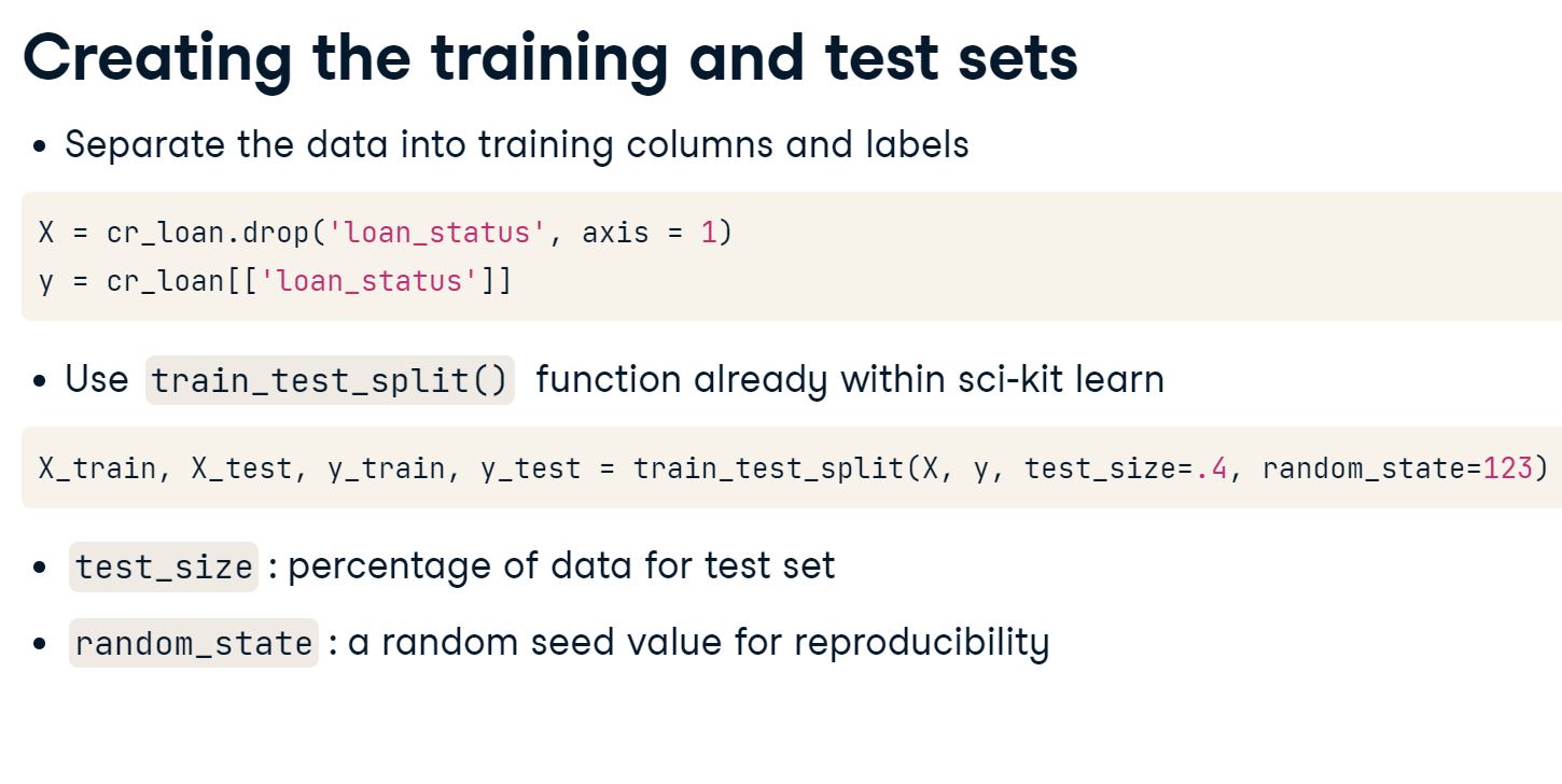
2.3 Creating training and test sets
We’ve just trained LogisticRegression() models on different columns. we know that the data should be separated into training and test sets. test_train_split() is used to create both at the same time. The training set is used to make predictions, while the test set is used for evaluation. Without evaluating the model, we have no way to tell how well it will perform on new loan data.
In addition to the intercept_, which is an attribute of the model, LogisticRegression() models also have the .coef_ attribute. This shows how important each training column is for predicting the probability of default.
Let’s create a data set X using interest rate, employment length, and income. Create the y set as always using our target variable (label) loan status :
# Create the X and y data setsX = cr_loan_clean[['loan_int_rate','person_emp_length','person_income']]y = cr_loan_clean[['loan_status']]# Use test_train_split to create the training and test setsX_train, X_test, y_train, y_test = train_test_split(X, y, test_size=.4, random_state=123)# Create and fit the logistic regression model to our training setclf_logistic = LogisticRegression(solver='lbfgs').fit(X_train, np.ravel(y_train))# Print the model coefficientsprint(clf_logistic .coef_)# Print the model interceptprint(clf_logistic.intercept_)
We can see that three columns were used for training and there are three values in .coef_. This tells us how important each column, or feature, was for predicting. The more positive the value, the more it predicts defaults, for example look at the value for loan_int_rate - 1.28517496e-09. This makes sense, the higher the interest rate the higher the loan repayments and therefore an increased risk of default. On the other hand we have negative values for both employment length and income. This also makes sense. A long time in employment suggests stability and the higher a person’s income is the less likely they are to default, as they are more likely to meet the loan repayments.
We can plug these 4 values into our Logistic Regression formula to arrive at the overall prediciton for loan default :
co_efficients.JPG
2.4 Changing coefficients
With this understanding of the coefficients of a LogisticRegression() model, let’s have a closer look at them to see how they change depending on what columns are used for training. Will the column coefficients change from model to model?
We should .fit() two different LogisticRegression() models on different groups of columns to check. We should also consider what the potential impact on the probability of default might be.
# create X1, X2 and y datasetsX1 = cr_loan_clean[['person_income','person_emp_length','loan_amnt']]X2 = cr_loan_clean[['person_income','loan_percent_income','cb_person_cred_hist_length']]y = cr_loan_clean[['loan_status']]
# train, test, splitX1_train, X1_test, y_train, y_test = train_test_split(X1, y, test_size=.4, random_state=123)X2_train, X2_test, y_train, y_test = train_test_split(X2, y, test_size=.4, random_state=123)
# Print the first five rows of each training setprint(X1_train.head())print(X2_train.head())# Create and train a model on the first training dataclf_logistic1 = LogisticRegression(solver='lbfgs').fit(X1_train, np.ravel(y_train))# Create and train a model on the second training dataclf_logistic2 = LogisticRegression(solver='lbfgs').fit(X2_train, np.ravel(y_train))# Print the coefficients of each modelprint(clf_logistic1.coef_)print(clf_logistic2.coef_)
Notice that the coefficient for the person_income changed when we changed the data from X1-4.02643517e-05 to X2-2.17213449e-05. This is a reason to keep most of the data like we did in section 1, because the models will learn differently depending on what data they’re given!
2.5 One-hot encoding credit data
Python does not know how to deal with non-numeric columns, and so we have to use one-hot encoding to convert categorical data to a number - either 0 or 1.
one_hot_encoding.JPG
We can use get_dummies() from the pandas library to do this.
get_dummies.JPG
It’s time to prepare the non-numeric columns so they can be added to our LogisticRegression() model. Once the new columns have been created using one-hot encoding, we can concatenate them with the numeric columns to create a new data frame which will be used throughout the rest of the course for predicting probability of default.
Remember to only one-hot encode the non-numeric columns. Doing this to the numeric columns would create an incredibly wide data set!
# Create two data sets for numeric and non-numeric datacred_num = cr_loan_clean.select_dtypes(exclude=['object'])cred_str = cr_loan_clean.select_dtypes(include=['object'])# One-hot encode the non-numeric columnscred_str_onehot = pd.get_dummies(cred_str)# Union the one-hot encoded columns to the numeric onescr_loan_prep = pd.concat([cred_num, cred_str_onehot], axis=1)# Print the columns in the new data setprint(cr_loan_prep.columns)
Look at all those columns! If you’ve ever seen a credit scorecard, the column_name_value format should look familiar. If you haven’t seen one, look up some pictures during your next break!
2.6 Predicting probability of default
predict.JPG
All of the data processing is complete and it’s time to begin creating predictions for probability of default. We want to train a LogisticRegression() model on the data, and examine how it predicts the probability of default.
So that we can better grasp what the model produces with predict_proba, you should look at an example record alongside the predicted probability of default. How do the first five predictions look against the actual values of loan_status?
cr_loan_prep
person_age
person_income
person_emp_length
loan_amnt
loan_int_rate
loan_status
loan_percent_income
cb_person_cred_hist_length
person_home_ownership_MORTGAGE
person_home_ownership_OTHER
...
loan_intent_VENTURE
loan_grade_A
loan_grade_B
loan_grade_C
loan_grade_D
loan_grade_E
loan_grade_F
loan_grade_G
cb_person_default_on_file_N
cb_person_default_on_file_Y
1
21
9600
5.0
1000
11.14
0
0.10
2
0
0
...
0
0
1
0
0
0
0
0
1
0
2
25
9600
1.0
5500
12.87
1
0.57
3
1
0
...
0
0
0
1
0
0
0
0
1
0
3
23
65500
4.0
35000
15.23
1
0.53
2
0
0
...
0
0
0
1
0
0
0
0
1
0
4
24
54400
8.0
35000
14.27
1
0.55
4
0
0
...
0
0
0
1
0
0
0
0
0
1
5
21
9900
2.0
2500
7.14
1
0.25
2
0
0
...
1
1
0
0
0
0
0
0
1
0
...
...
...
...
...
...
...
...
...
...
...
...
...
...
...
...
...
...
...
...
...
...
32576
57
53000
1.0
5800
13.16
0
0.11
30
1
0
...
0
0
0
1
0
0
0
0
1
0
32577
54
120000
4.0
17625
7.49
0
0.15
19
1
0
...
0
1
0
0
0
0
0
0
1
0
32578
65
76000
3.0
35000
10.99
1
0.46
28
0
0
...
0
0
1
0
0
0
0
0
1
0
32579
56
150000
5.0
15000
11.48
0
0.10
26
1
0
...
0
0
1
0
0
0
0
0
1
0
32580
66
42000
2.0
6475
9.99
0
0.15
30
0
0
...
0
0
1
0
0
0
0
0
1
0
29459 rows × 27 columns
# set features and target variableX = cr_loan_prep.drop('loan_status', axis=1)y = cr_loan_prep[['loan_status']]# train, test, splitX_train, X_test, y_train, y_test = train_test_split(X, y, test_size=.4, random_state=123)
# Train the logistic regression model on the training dataclf_logistic = LogisticRegression(solver='lbfgs').fit(X_train, np.ravel(y_train))# Create predictions of probability for loan status using test datapreds = clf_logistic.predict_proba(X_test)# Create dataframes of first five predictionspreds_df = pd.DataFrame(preds[:,1][0:5], columns = ['prob_default'])# Create dataframe of first five true labelstrue_df = y_test.head()# Concatenate and print the two data frames for comparisonprint(pd.concat([true_df.reset_index(drop =True), preds_df], axis =1))
We have some predictions now, but they don’t look very accurate do they? It looks like most of the rows with loan_status at 1 have a low probability of default. How good are the rest of the predictions? Next, let’s see if we can determine how accurate the entire model is.
2.7 Default classification reporting
accuracy.JPG
It’s time to take a closer look at the evaluation of our model. Here is where setting the threshold for probability of default will help us analyze the model’s performance through classification reporting.
Creating a data frame of the probabilities makes them easier to work with, because we can use all the power of pandas. Apply the threshold to the data and check the value counts for both classes of loan_status to see how many predictions of each are being created. This will help with insight into the scores from the classification report.
preds_df
prob_default
0
0.445779
1
0.223447
2
0.288558
3
0.169358
4
0.114182
# Create a dataframe for the probabilities of defaultpreds_df = pd.DataFrame(preds[:,1], columns = ['prob_default'])# Reassign loan status based on the thresholdpreds_df['loan_status'] = preds_df['prob_default'].apply(lambda x: 1if x >0.5else0) # lambda alllows us to use a function without defining it using def:# Print the row counts for each loan statusprint(preds_df['loan_status'].value_counts())# Print the classification reporttarget_names = ['Non-Default', 'Default'] # our labelsprint(classification_report(y_test, preds_df['loan_status'], target_names=target_names))
Well isn’t this a surprise! It looks like almost all of our test set was predicted to be non-default. The recall for defaults is 0.17 meaning 17% of our true defaults were predicted correctly.
2.8 Selecting report metrics
The classification_report() has many different metrics within it, but you may not always want to print out the full report. Sometimes you just want specific values to compare models or use for other purposes.
There is a function within scikit-learn that pulls out the values for you. That function is precision_recall_fscore_support() and it takes in the same parameters as classification_report.
It is imported and used like this:
# Import function
from sklearn.metrics import precision_recall_fscore_support
# Select all non-averaged values from the report
precision_recall_fscore_support(y_true,predicted_values)
# Print the classification reporttarget_names = ['Non-Default', 'Default']print(classification_report(y_test, preds_df['loan_status'], target_names=target_names))
# Print the first two numbers from the reportprint(precision_recall_fscore_support(y_test,preds_df['loan_status'])[0])
[0.80742729 0.71264368]
Now we know how to pull out specific values from the report to either store later for comparison, or use to check against portfolio performance. Remember the impact of recall for defaults? This way, we can store that value for later calculations.
2.9 Visually scoring credit models
ROC.JPG
ROC_chart.JPG
Now, we want to visualize the performance of the model. In ROC charts, the X and Y axes are two metrics we’ve already looked at: the false positive rate (fall-out), and the true positive rate (sensitivity).
We can create a ROC chart of it’s performance with the following code:
To calculate the AUC score, you use roc_auc_score()
# Create predictions and store them in a variablepreds= clf_logistic.predict_proba(X_test)# Print the accuracy score the modelprint(clf_logistic.score(X_test, y_test))# Plot the ROC curve of the probabilities of defaultprob_default = preds[:, 1]fallout, sensitivity, thresholds = roc_curve(y_test, prob_default)fig, ax = plt.subplots()plt.plot(fallout, sensitivity, color ='darkorange')plt.plot([0, 1], [0, 1], linestyle='--')ax.set_xlabel('False Positive Rate (Fallout)')ax.set_ylabel('True Positive Rate (Sensitivity)')plt.show()# Compute the AUC and store it in a variableauc = roc_auc_score(y_test, prob_default)auc
0.8025288526816021
0.7643248801355148
So the accuracy for this model is just over 80.3% and the AUC score is 76.4%. Notice that what the ROC chart above shows us is the tradeoff between all values of our false positive rate (fallout) and true positive rate (sensitivity).
2.10 Thresholds and confusion matrices
thresholds.JPG
confusion_matrix.JPG
The recall score for loan defaults is the number of correctly predicted defaults divided by the total number of defaults. Note that if we were to predict ALL of our loans to default, then our recall score would be 100%!
The recall score for non-defaults is the number of correctly predicted non-defaults, divided by the total number of non-defaults.
The precision score for loan defaults is the number of correctly predicted defaults divided by the total number of predicted defaults.
The precision score for non-loan defaults is the number of correctly predicted non-defaults, divided by the total number of predicted non-defaults.
We’ve looked at setting thresholds for defaults, but how does this impact overall performance? To do this, we can start by looking at the effects with confusion matrices. Set different values for the threshold on probability of default, and use a confusion matrix to see how the changing values affect the model’s performance.
# Set the threshold for defaults to 0.5preds_df['loan_status'] = preds_df['prob_default'].apply(lambda x: 1if x >0.5else0)# Print the confusion matrixprint(confusion_matrix(y_test,preds_df['loan_status']))
# Set the threshold for defaults to 0.4preds_df['loan_status'] = preds_df['prob_default'].apply(lambda x: 1if x >0.4else0)# Print the confusion matrixy_test,preds_df['loan_status']
Setting the threshold to 0.4 shows promising results for model evaluation. Now we can assess the financial impact using the default recall which is selected from the classification reporting using the function precision_recall_fscore_support().
For this, we will estimate the amount of unexpected loss using the default recall to find what proportion of defaults you did not catch with the new threshold. This will be a dollar amount which tells you how much in losses you would have if all the unfound defaults were to default all at once.
# Reassign the values of loan status based on the new thresholdpreds_df['loan_status'] = preds_df['prob_default'].apply(lambda x: 1if x >0.4else0)# Store the number of loan defaults from the prediction datanum_defaults = preds_df['loan_status'].value_counts()[1]# Store the default recall from the classification reportdefault_recall = precision_recall_fscore_support(y_test,preds_df['loan_status'])[1][1]# Calculate the estimated impact of the new default recall rateprint(cr_loan_prep['loan_amnt'].mean() * num_defaults * (1- default_recall))
9872265.223119883
By our estimates, this loss would be around $9.8 million. That seems like a lot! Try rerunning this code with threshold values of 0.3 and 0.5. Do you see the estimated losses changing? How do we find a good threshold value based on these metrics alone?
2.12 Threshold selection
thresholds_apply.JPG
We know there is a trade off between metrics like default recall, non-default recall, and model accuracy. One easy way to approximate a good starting threshold value is to look at a plot of all three using matplotlib. With this graph, you can see how each of these metrics look as you change the threshold values and find the point at which the performance of all three is good enough to use for the credit data.
Have a closer look at this plot. In fact, expand the window to get a really good look. Think about the threshold values from thresh and how they affect each of these three metrics. Approximately what starting threshold value would maximize these scores evenly?
This is the easiest pattern to see on this graph, because it’s the point where all three lines converge. This threshold would make a great starting point, but declaring all loans about 0.275 to be a default is probably not practical.
3. Gradient Boosted Trees Using XGBoost
Decision trees are another standard credit risk model. We will go beyond decision trees by using the trendy XGBoost package in Python to create gradient boosted trees. After developing sophisticated models, we will stress test their performance and discuss column selection in unbalanced data.
3.1 Trees for defaults
We will now train a Gradient Boosted Tree model on the credit data, and see a sample of some of the predictions. Do you remember when we first looked at the predictions of the logistic Regression model? They didn’t look good. Do you think this model will be different?
# Train a model!pip install xgboostimport xgboost as xgbclf_gbt = xgb.XGBClassifier().fit(X_train, np.ravel(y_train))# Predict with a modelgbt_preds = clf_gbt.predict_proba(X_test)# Create dataframes of first five predictions, and first five true labelspreds_df = pd.DataFrame(gbt_preds[:,1][0:5], columns = ['prob_default'])true_df = y_test.head()# Concatenate and print the two data frames for comparisonprint(pd.concat([true_df.reset_index(drop =True), preds_df], axis =1))
The predictions don’t look the same as with the LogisticRegression(), do they? Notice that this model is already accurately predicting the probability of default for some loans with a true value of 1 in loan_status.
3.2 Gradient boosted portfolio performance
At this point we’ve looked at predicting probability of default using both a LogisticRegression() and XGBClassifier(). We’ve looked at some scoring and have seen samples of the predictions, but what is the overall affect on portfolio performance? Try using expected loss as a scenario to express the importance of testing different models.
A data frame called portfolio has been cretaed to combine the probabilities of default for both models, the loss given default (assume 20% for now), and the loan_amnt which will be assumed to be the exposure at default.
# Print the first five rows of the portfolio data frameprint(portfolio.head())
portfolio_head.JPG
# Create expected loss columns for each model using the formulaportfolio['gbt_expected_loss'] = portfolio['gbt_prob_default'] * portfolio['lgd'] * portfolio['loan_amnt']portfolio['lr_expected_loss'] = portfolio['lr_prob_default'] * portfolio['lgd'] * portfolio['loan_amnt']# Print the sum of the expected loss for lrprint('LR expected loss: ', np.sum(portfolio['lr_expected_loss']))# Print the sum of the expected loss for gbtprint('GBT expected loss: ', np.sum(portfolio['gbt_expected_loss']))
LR expected loss: 5596776.979852879 GBT expected loss: 5383982.809227714
It looks like the total expected loss for the XGBClassifier() model is quite a bit lower. When we talk about accuracy and precision, the goal is to generate models which have a low expected loss. Looking at a classification_report() helps as well.
3.3 Assessing gradient boosted trees
So we’ve now used XGBClassifier() models to predict probability of default. These models can also use the .predict() method for creating predictions that give the actual class for loan_status.
We should check the model’s initial performance by looking at the metrics from the classification_report(). Keep in mind that we have not set thresholds for these models yet.
# Predict the labels for loan statusgbt_preds= clf_gbt.predict(X_test)# Check the values created by the predict methodprint(gbt_preds)# Print the classification report of the modeltarget_names = ['Non-Default', 'Default']print(classification_report(y_test, gbt_preds, target_names=target_names))
Have a look at the precision and recall scores! Remember the low default recall values we were getting from the LogisticRegression()? This model already appears to have serious potential.
3.4 Column importance and default prediction
column_importance.JPG
When using multiple training sets with many different groups of columns, it’s important to keep an eye on which columns matter and which do not. It can be expensive or time-consuming to maintain a set of columns even though they might not have any impact on loan_status.
The X data for this exercise was created with the following code:
X = cr_loan_prep[['person_income','loan_int_rate',
              'loan_percent_income','loan_amnt',
              'person_home_ownership_MORTGAGE','loan_grade_F']]
Train an XGBClassifier() model on this data, and check the column importance to see how each one performs to predict loan_status.
# Create and train the model on the training datagbt = xgb.XGBClassifier().fit(X_train,np.ravel(y_train))# Print the column importances from the modelprint(gbt.get_booster().get_score(importance_type ='weight'))
So, the importance for loan_grade_F is only 9 in this case. This could be because there are so few of the F-grade loans. While the F-grade loans don’t add much to predictions here, they might affect the importance of other training columns.
3.5 Visualizing column importance
column_importance_plot.JPG
When the model is trained on different sets of columns it changes the performance, but does the importance for the same column change depending on which group it’s in?
The data sets X2 and X3 have been created with the following code:
# train, test, splitX2_train, X2_test, y_train, y_test = train_test_split(X2, y, test_size=.4, random_state=123)X3_train, X3_test, y_train, y_test = train_test_split(X3, y, test_size=.4, random_state=123)
Understanding how different columns are used to arrive at a loan_status prediction is very important for model interpretability.
# Train a model on the X data with 2 columnsgbt2 = xgb.XGBClassifier().fit(X2_train,np.ravel(y_train))# Plot the column importance for this modelxgb.plot_importance(gbt2, importance_type ='weight')plt.show()
# Train a model on the X data with 3 columnsgbt3 = xgb.XGBClassifier().fit(X3_train,np.ravel(y_train))# Plot the column importance for this modelxgb.plot_importance(gbt3, importance_type ='weight')plt.show()
Take a closer look at the plots. Did you notice that the importance of loan_int_rate went from 1490 to 1013? Initially, this was the most important column, but person_income ended up taking the top spot here.
3.6 Column selection and model performance
train_columns.JPG
Creating the training set from different combinations of columns affects the model and the importance values of the columns. Does a different selection of columns also affect the F-1 scores, the combination of the precision and recall, of the model? You can answer this question by training two different models on two different sets of columns, and checking the performance.
Inaccurately predicting defaults as non-default can result in unexpected losses if the probability of default for these loans was very low. You can use the F-1 score for defaults to see how the models will accurately predict the defaults.
# Predict the loan_status using each modelgbt_preds = gbt.predict(X_test)gbt2_preds = gbt2.predict(X2_test)# Print the classification report of the first modeltarget_names = ['Non-Default', 'Default']print(classification_report(y_test,gbt_preds, target_names=target_names))# Print the classification report of the second modelprint(classification_report(y_test, gbt2_preds, target_names=target_names))
Originally, it looked like the selection of columns affected model accuracy the most, but now we see that the selection of columns also affects recall by quite a bit.
3.7 Cross validating credit models
We cannot create more loan data to help us to develop our model but we can use cross-validation to simulate how our model will perform on new laon data before it comes in.
cross_validation.JPG
k_fold.JPG
xgb_cross_valid_setup.JPG
xgb_cross_valid_setup_2.JPG
# Set the values for number of folds and stopping iterationsn_folds =5early_stopping =10# define params dictionaryparams = {'objective': 'binary:logistic', 'seed': 123, 'eval_metric': 'auc'}# Create the DTrain matrix for XGBoostDTrain = xgb.DMatrix(X_train, label = y_train)# Create the data frame of cross validationscv_df = xgb.cv(params, DTrain, num_boost_round =5, nfold=n_folds, early_stopping_rounds=early_stopping)# Print the cross validations data frameprint(cv_df)
Looks good! Note how the AUC for both train-auc-mean and test-auc-mean improves at each iteration of cross-validation. The improvements suggest that our model has stability, however if we increase iterations will our scores improve until they eventually reach 1.0 ?
3.8 Limits to cross-validation testing
We can specify very large numbers for both nfold and num_boost_round if we want to perform an extreme amount of cross-validation. The data frame cv_results_big was created with the following code:
Here, cv() performed 600 iterations of cross-validation! The parameter shuffle tells the function to shuffle the records each time.
Have a look at this data to see what the AUC are, and check to see if they reach 1.0 using cross validation. We should also plot the test AUC score to see the progression.
# Print the first five rows of the CV results data framecv_results_big.head()
# Calculate the mean of the test AUC scoresnp.mean(cv_results_big.head()['test-auc-mean']).round(2)# Plot the test AUC scores for each iterationplt.plot(cv_results_big['test-auc-mean'])plt.title('Test AUC Score Over 600 Iterations')plt.xlabel('Iteration Number')plt.ylabel('Test AUC Score')plt.show()
Notice that the test AUC score never quite reaches 1.0 and begins to decrease slightly after 100 iterations. This is because this much cross-validation can actually cause the model to overfit. So, there is a limit to how much cross-validation we should do.
3.9 Cross-validation scoring
cross_val_score.JPG
Now, we should use cross-validation scoring with cross_val_score() to check the overall performance.
This is exercise presents an excellent opportunity to test out the use of the hyperparameters learning_rate and max_depth. Remember, hyperparameters are like settings which can help create optimum performance.
cr_loan_prep
X = cr_loan_prep.drop('loan_status', axis =1)# train, test, splitX_train, X_test, y_train, y_test = train_test_split(X, y, test_size=.4, random_state=123)
X_train
# importfrom sklearn.model_selection import cross_val_score# Create a gradient boosted tree model using two hyperparametersgbt = xgb.XGBClassifier(learning_rate =0.1, max_depth =7)# Calculate the cross validation scores for 4 foldscv_scores = cross_val_score(gbt, X_train, np.ravel(y_train), cv=4)# Print the cross validation scoresprint(cv_scores)# Print the average accuracy and standard deviation of the scoresprint("Average accuracy: %0.2f (+/- %0.2f)"% (cv_scores.mean(), cv_scores.std() *2))
Our average cv_score for this model is getting higher! With only a couple of hyperparameters and cross-validation, we can get the average accuracy up to 93%. This is a great way to validate how robust the model is.
3.10 Undersampling training data
We just used cross validation to check the robustness of our model but let’s look at how the data impacts the robustness of our model. In our training dataset there are far more non-defaults than defaults. This is referred to as class imbalance and is a problem.
imbalance_causes.JPG
y_train['loan_status'].value_counts()
We have 13,798 non defaults (78%) and 3,877 defaults (22%).
Our tree models use a function called log-loss which our model tries to minimise. Take the example below, where we have one default and one non-default. Each of the predictions is equally far away from the true outcome, and so the log-losss value is the same - however, the financial implications of an incorrect default prediction are much more severe than an incorrect non-default prediction.
One strategy we can adopt to restore the balance of our training data is undersampling :
undersampling.JPG
undersample_train_test_split_1.JPG
undersample_train_test_split_2.JPG
It’s time to undersample the training set with a few lines of code from pandas. Once the undersampling is complete, we can check the value counts for loan_status to verify the results.
# Concat the training setsX_y_train = pd.concat([X_train.reset_index(drop =True), y_train.reset_index(drop =True)], axis =1)# Get counts of non default and defaultscount_nondefault, count_default = X_y_train['loan_status'].value_counts()
# Create data sets for defaults and non-defaultsnondefaults = X_y_train[X_y_train['loan_status'] ==0]defaults = X_y_train[ X_y_train['loan_status'] ==1]# Undersample the non-defaultsnondefaults_under = nondefaults.sample(count_default)# Concatenate the undersampled nondefaults with defaultsX_y_train_under = pd.concat([nondefaults_under.reset_index(drop =True), defaults.reset_index(drop =True)], axis =0)# Print the value counts for loan statusprint(X_y_train_under['loan_status'].value_counts())
Great. We now have a training set with an equal number of defaults and non-defaults. Let’s test out some machine learning models on this new undersampled data set and compare their performance to the models trained on the regular data set.
3.11 Undersampled tree performance
We’ve undersampled the training set and trained a model on the undersampled set.
The performance of the model’s predictions not only impact the probability of default on the test set, but also on the scoring of new loan applications as they come in. We also now know that it is even more important that the recall of defaults be high, because a default predicted as non-default is more costly.
The next crucial step is to compare the new model’s performance to the original model.
# Check the classification reportstarget_names = ['Non-Default', 'Default']# print classification report for old modelprint(classification_report(y_test, gbt_preds, target_names=target_names))
# Print the confusion matrix for old modelprint(confusion_matrix(y_test,gbt_preds))
[[9105 93] [ 691 1895]]
# Print the confusion matrix for new modelprint(confusion_matrix(y_test,gbt2_preds))
[[8338 860] [ 426 2160]]
# Print and compare the AUC scores of the old modelprint(roc_auc_score(y_test, gbt_preds))
0.8613405315086655
# Print and compare the AUC scores of the new modelprint(roc_auc_score(y_test,gbt2_preds))
0.870884117348218
Looks like this is classified as a success! Undersampling the training data results in more false positives, but the recall for defaults and the AUC score are both higher than the original model. This means overall it predicts defaults much more accurately.
3.12 Undersampling intuition
Now we’ve seen the effects of undersampling the training set to improve default prediction. We undersampled the training data set X_train, and it had a positive impact on the new model’s AUC score and recall for defaults. The training data had class imbalance which is normal for most credit loan data.
We did not undersample the test data X_test. Why not undersample the test set as well?
The test set represents the type of data that will be seen by the model in the real world, so changing it would test the model on unrealistic data.
4. Model evaluation and implementation
After developing and testing two powerful machine learning models, we use key performance metrics to compare them. Using advanced model selection techniques specifically for financial modeling, we will select one model. With that model, we will:
develop a business strategy
estimate portfolio value, and
minimize expected loss
4.1 Comparing model reports
We’ve used logistic regression models and gradient boosted trees. It’s time to compare these two to see which model will be used to make the final predictions.
One of the easiest first steps for comparing different models’ ability to predict the probability of default is to look at their metrics from the classification_report(). With this, we can see many different scoring metrics side-by-side for each model. Because the data and models are normally unbalanced with few defaults, focus on the metrics for defaults for now.
# Print the default F-1 scores for the logistic regressionprint(precision_recall_fscore_support(y_test,preds_df_lr['loan_status'], average ='macro')[2])
0.7108943782814463
# Print the default F-1 scores for the gradient boosted treeprint(precision_recall_fscore_support(y_test,preds_df_gbt['loan_status'], average ='macro')[2])
0.8909014142736051
There is a noticeable difference between these two models. The scores from the classification_report() are all higher for the gradient boosted tree. This means the tree model is better in all of these aspects. Let’s check the ROC curve.
4.2 Comparing with ROCs and AUCs
We should use ROC charts and AUC scores to compare the two models. Sometimes, visuals can really help you and potential business users understand the differences between the various models under consideration.
With the graph in mind, we will be more equipped to make a decision. The lift is how far the curve is from the random prediction. The AUC is the area between the curve and the random prediction. The model with more lift, and a higher AUC, is the one that’s better at making predictions accurately.
# ROC chart componentsfallout_lr, sensitivity_lr, thresholds_lr = roc_curve(y_test, clf_logistic_preds)fallout_gbt, sensitivity_gbt, thresholds_gbt = roc_curve(y_test, clf_gbt_preds)# ROC Chart with bothplt.plot(fallout_lr, sensitivity_lr, color ='blue', label='%s'%'Logistic Regression')plt.plot(fallout_gbt, sensitivity_gbt, color ='green', label='%s'%'GBT')plt.plot([0, 1], [0, 1], linestyle='--', label='%s'%'Random Prediction')plt.title("ROC Chart for LR and GBT on the Probability of Default")plt.xlabel('Fall-out')plt.ylabel('Sensitivity')plt.legend()plt.show()
# Print the logistic regression AUC with formattingprint("Logistic Regression AUC Score: %0.2f"% roc_auc_score(y_test, clf_logistic_preds))# Print the gradient boosted tree AUC with formattingprint("Gradient Boosted Tree AUC Score: %0.2f"% roc_auc_score(y_test, clf_gbt_preds))
Look at the ROC curve for the gradient boosted tree. Not only is the lift much higher, the calculated AUC score is also quite a bit higher. It’s beginning to look like the gradient boosted tree is best. Let’s check the calibration to be sure.
4.3 Calibration curves
calibration.JPG
calibration_calc.JPG
We now know that the gradient boosted tree clf_gbt has the best overall performance. You need to check the calibration of the two models to see how stable the default prediction performance is across probabilities. We can use a chart of each model’s calibration to check this by calling the calibration_curve() function.
Calibration curves can require many lines of code in python, so we will go through each step slowly to add the different components.
# Create the calibration curve plot with the guidelineplt.plot([0, 1], [0, 1], 'k:', label="Perfectly calibrated") plt.ylabel('Fraction of positives')plt.xlabel('Average Predicted Probability')plt.legend()plt.title('Calibration Curve')plt.show()
# Add the calibration curve for the logistic regression to the plotplt.plot([0, 1], [0, 1], 'k:', label='Perfectly calibrated') plt.plot(mean_pred_val_lr, frac_of_pos_lr,'s-', label='%s'%'Logistic Regression')plt.ylabel('Fraction of positives')plt.xlabel('Average Predicted Probability')plt.legend()plt.title('Calibration Curve')plt.show()
# Add the calibration curve for the gradient boosted treeplt.plot([0, 1], [0, 1], 'k:', label='Perfectly calibrated') plt.plot(mean_pred_val_lr, frac_of_pos_lr,'s-', label='%s'%'Logistic Regression')plt.plot(mean_pred_val_gbt, frac_of_pos_gbt,'s-', label='%s'%'Gradient Boosted tree')plt.ylabel('Fraction of positives')plt.xlabel('Average Predicted Probability')plt.legend()plt.title('Calibration Curve')plt.show()
Take a good look at this. Notice that for the logistic regression, the calibration for probabilities starts off great but then gets more erratic as it the average probability approaches 0.4. Something similar happens to the gradient boosted tree around 0.5, but the model eventually stabilizes. We will be focusing only on the gbt model from now on.
4.4 Acceptance rates
Setting an acceptance rate and calculating the threshold for that rate can be used to set the percentage of new loans we want to accept.
acceptance_rate.JPG
In the above example, the distribution of our loans is represented in terms of their probability of default. 85% of our loans are to the left of the dashed line, with and 15% are to the right of the dashed line. If our policy is to ensure that 15% of loans are rejected, then the dashed line represents the acceptance threshold. We can see by reading off the graph that we should therefore reject any new loan applications with predicted probability of default of around 78% or above.
In our example, the exact acceptance threshold can be calculated using Numpy quantile.
import numpy as np
threshold = np.quantile(prob_default, 0.85)
We would then reassign our loan_status values as we did before arbitrarily, with the calculated threshold:
preds_df['loan_status'] = preds_df['prob_default'].apply(lambda x: 1 if x > 0.78 else 0)
Let’s see how this works in more detail by applying to our loan data. For this exercise, assume the test data is a fresh batch of new loans. We will need to use the quantile() function from numpy to calculate the threshold.
The threshold should be used to assign new loan_status values. Does the number of defaults and non-defaults in the data change?
# Check the statistics of the probabilities of defaultprint(test_pred_df['prob_default'].describe())
default_stats.JPG
# Calculate the threshold for a 85% acceptance ratethreshold_85= np.quantile(test_pred_df['prob_default'], 0.85)
0.8039963573217376
# Apply acceptance rate thresholdtest_pred_df['pred_loan_status'] = test_pred_df['prob_default'].apply(lambda x: 1if x > threshold_85 else0)# Print the counts of loan status after the thresholdprint(test_pred_df['pred_loan_status'].value_counts())
loan_status_counts.JPG
In the results of .describe() we can see how it’s not until 75% that we start to see double-digit numbers. That’s because the majority of our test set is non-default loans. Next let’s look at how the acceptance rate and threshold split up the data.
4.5 Visualizing quantiles of acceptance
We know how quantile() works to compute a threshold, and we’ve seen an example of what it does to split the loans into accepted and rejected. What does this threshold look like for the test set, and how can you visualize it? To check this, we can create a histogram of the probabilities and add a reference line for the threshold. With this, we can visually show where the threshold exists in the distribution.
# Plot the predicted probabilities of defaultplt.hist(clf_gbt_preds, color ='blue', bins =40)# Calculate the threshold with quantilethreshold = np.quantile(clf_gbt_preds, 0.85)# Add a reference line to the plot for the thresholdplt.axvline(x = threshold, color ='red')plt.show()
Here, we can clearly see where the threshold is on the range of predicted probabilities - 0.804 as calculated in section 4.4 - and indicated by the red line. Not only can we see how many loans will be accepted (left side), but also how many loans will be rejected (right side).
4.6 Bad rates
bad_rate.JPG
With acceptance rate in mind, we can now analyze the bad rate within the accepted loans. This way we will be able to see the percentage of defaults that have been accepted. Think about the impact of the acceptance rate and bad rate. We set an acceptance rate to have fewer defaults in the portfolio because defaults are more costly. Will the bad rate be less than the percentage of defaults in the test data?
# Print the top 5 rows of the new data frameprint(test_pred_df.head())
# Create a subset of only accepted loansaccepted_loans = test_pred_df[test_pred_df['pred_loan_status'] ==0]# Calculate the bad rateprint(np.sum(accepted_loans['true_loan_status']) / accepted_loans['true_loan_status'].count())
0.08256789137380191
This bad rate doesn’t look half bad! The bad rate with the threshold set by the 85% quantile() is just over 8%. This means that of all the loans we’ve decided to accept from the test set, only 8% were actual defaults! If we accepted all loans, the percentage of defaults would be around 22%.
4.7 Acceptance rate impact
Now, look at the loan_amnt of each loan to understand the impact on the portfolio for the acceptance rates. We can use cross tables with calculated values, like the average loan amount, of the new set of loans X_test. For this, we will multiply the number of each with an average loan_amnt value.
When printing these values, try formatting them as currency so that the numbers look more realistic. After all, credit risk is all about money. This is accomplished with the following code:
# Print the statistics of the loan amount columnprint(test_pred_df['loan_amnt'].describe())
loan_amount_stats.JPG
# Store the average loan amountavg_loan = np.mean(test_pred_df['loan_amnt'])# Set the formatting for currency, and print the cross tabpd.options.display.float_format ='${:,.2f}'.format# print the cross tableprint(pd.crosstab(test_pred_df['true_loan_status'], test_pred_df['pred_loan_status_15']).apply(lambda x: x * avg_loan, axis =0))
pred_loan_status.JPG
With this, we can see that our bad rate of about 8% represents an estimated loan value of about 7.9 million dollars. This may seem like a lot at first, but compare it to the total value of non-default loans! With this, we are ready to start talking about our acceptance strategy going forward.
4.8 Making the strategy table
Before we implement a strategy, we should first create a strategy table containing all the possible acceptance rates we wish to look at along with their associated bad rates and threshold values. This way, we can begin to see each part of our strategy and how it affects our portfolio.
Automatically calculating all of these values only requires a for loop, but requires many lines of python code.
strategy_table_setup.JPG
strategy_table_calcs.JPG
# create empty lists for thresholds and bad rates - to be appendedthresholds = []bad_rates = []
# let's set the accept rates that we would like to compare calculations foraccept_rates = [1.0, 0.95, 0.9, 0.85, 0.8, 0.75, 0.7, 0.65, 0.6, 0.55, 0.5, 0.45, 0.4, 0.35, 0.3, 0.25, 0.2, 0.15, 0.1, 0.05]
# Populate the arrays for the strategy table with a for loopfor rate in accept_rates:# Calculate the threshold for the acceptance rate thresh = np.quantile(preds_df_gbt['prob_default'], rate).round(3)# Add the threshold value to the list of thresholds thresholds.append(np.quantile(preds_df_gbt['prob_default'], rate).round(3))# Reassign the loan_status value using the threshold test_pred_df['pred_loan_status'] = test_pred_df['prob_default'].apply(lambda x: 1if x > thresh else0)# Create a set of accepted loans using this acceptance rate accepted_loans = test_pred_df[test_pred_df['pred_loan_status'] ==0]# Calculate and append the bad rate using the acceptance rate bad_rates.append(np.sum((accepted_loans['true_loan_status']) /len(accepted_loans['true_loan_status'])).round(3))
# Create a data frame of the strategy tablestrat_df = pd.DataFrame(zip(accept_rates, thresholds, bad_rates), columns = ['Acceptance Rate','Threshold','Bad Rate'])# Print the entire tablestrat_df
Acceptance Rate
Threshold
Bad Rate
0
1.00
1.000
0.219
1
0.95
0.992
0.179
2
0.90
0.976
0.132
3
0.85
0.804
0.083
4
0.80
0.254
0.061
5
0.75
0.178
0.052
6
0.70
0.138
0.043
7
0.65
0.111
0.036
8
0.60
0.093
0.030
9
0.55
0.078
0.027
10
0.50
0.066
0.023
11
0.45
0.055
0.020
12
0.40
0.045
0.017
13
0.35
0.037
0.014
14
0.30
0.030
0.010
15
0.25
0.022
0.008
16
0.20
0.015
0.005
17
0.15
0.008
0.001
18
0.10
0.004
0.000
19
0.05
0.002
0.000
That for loop was a lot of code, but look at the strategy table we have now. This uses our specific predictions on the credit data, and can be used to see the acceptance rates, bad rates, and financial impact all at once. One of these values has the highest estimated value.
4.9 Visualizing the strategy
Now we have the extended strategy table strat_df. The table is not so big that it’s difficult to analyze, but visuals can help us see the overview all at once.
We should check the distribution of each column with a box plot. If the distribution of Acceptance Rate looks the same as the Bad Rate column, that could be a problem. That means that the model’s calibration is likely much worse than we thought.
We can also visualize the strategy curve with a line plot. The Acceptance Rate would be the independent variable with the Bad Rate as the dependent variable.
# Visualize the distributions in the strategy table with a boxplotstrat_df.boxplot()plt.show()
The boxplots above show us the distribution for each column.
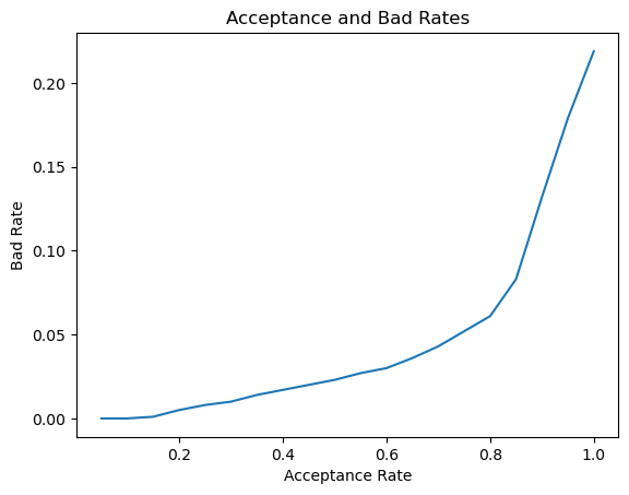
# Plot the strategy curveplt.plot(strat_df['Acceptance Rate'], strat_df['Bad Rate']) plt.plot()plt.xlabel('Acceptance Rate')plt.ylabel('Bad Rate')plt.title('Acceptance and Bad Rates')plt.show()
The bad rates are very low up until the acceptance rate 0.6 where they suddenly increase. This suggests that many of the accepted defaults may have a prob_default value between 0.6 and 0.8.
4.10 Estimated value profiling
The strategy table, strat_df, can be used to maximize the estimated portfolio value and minimize expected loss. Extending this table and creating some plots can be very helpful to this end.
The strat_df data frame is loaded and has been enhanced already with the following columns:
strategy_table_prepop.JPG
# Create a line plot of estimated valueplt.plot(strat_df['Acceptance Rate'],strat_df['Estimated Value'])plt.title('Estimated Value by Acceptance Rate')plt.xlabel('Acceptance Rate')plt.ylabel('Estimated Value')plt.show()
# Print the row with the max estimated valueprint(strat_df.loc[strat_df['Estimated Value'] == np.max(strat_df['Estimated Value'])])
max_est_value.JPG
Interesting! With our credit data and our estimated averag loan value, we clearly see that the acceptance rate 0.85 has the highest potential estimated value. Normally, the allowable bad rate is set, but we can use analyses like this to explore other options.
4.11 Total expected loss
total_expected_loss.JPG
It’s time to estimate the total expected loss given all our decisions. The data frame test_pred_df has the probability of default for each loan and that loan’s value. Use these two values to calculate the expected loss for each loan. Then, we can sum those values and get the total expected loss.
For this exercise, we will assume that the exposure is the full value of the loan, and the loss given default is 100%. This means that a default on each the loan is a loss of the entire amount.
# Print the first five rows of the data frameprint(test_pred_df.head())
test_pred_df.JPG
# Calculate the bank's expected loss and assign it to a new columntest_pred_df['expected_loss'] = test_pred_df['prob_default'] * test_pred_df['loss_given_default'] * test_pred_df['loan_amnt']# Calculate the total expected loss to two decimal placestot_exp_loss=round(np.sum(test_pred_df['expected_loss']),2)# Print the total expected lossprint('Total expected loss: ', '${:,.2f}'.format(tot_exp_loss))
Total expected loss: $27,084,153.38
This is the total expected loss for the entire portfolio using the gradient boosted tree. 27 million US dollars may seem like a lot, but the total expected loss would have been over 28 million US dollars with the logistic regression. Some losses are unavoidable, but our work here might have saved the company a million dollars!
Key takeaways
Our first step was to prepare credit data for machine learning models:
important to understand the data
improving the data allows for high performing simple models
We then developed, scored and now understand Logistic Regression and Gradient Boosted Trees:
these models are simple and explainable
their performance on probabilities is acceptable
We then analyzed the performance of models by changing the data, and now understand the financial impact of results.
We implemented the model with an understanding of strategy. The models and framework covered:
discrete-time hazard model (point in time): the probability of default is a point-in-time event
structural model framework: the model explains the default even based on other factors
Many financial sectors prefer model interpretability:
complex or black-box models are a risk because the business cannot explain their decisions fully. This is important, particularly when considering loan applications. The customer has a right to know on which basis their application was rejected
deep neural networks are often too complex
Leaving thoughts and acknowledgements
Focus on the data:
gather as much data as possible
use many different techniques to prepare and enhance data
learn about the business
increase value through data
Model complexity can be a double-edged sword:
really complex models may perform well, but are seen as a black box
in many cases, business users will not accept a model they cannot understand
complex models can be very large and difficult to put into production
Thanks to Michael Crabtree for creating this course on DataCamp. It explains how to interpret the coefficients and intercepts of a Logistic Regression model particularly well in my view.